
A little history.
A lot of character.
I’m Jason Braden. EkoSketch is where a love of memorable marks meets the practical business of making things.
Identity, apparel, signage, and the details that hold them together. I like work with a distinct point of view—and a life beyond the presentation.
Get to know the work
The things that stick.
Before a brand becomes a system, something makes you remember it.
Memory.
A Honda motorcycle logo caught my attention as a kid. That wing was an early lesson in how much a simple mark could say.
Color.
The red and gold of Kodak-era film stayed with me. Familiar colors, carrying a feeling long after the moment has passed.
Motion.
A wing becomes a pencil. The Pencil Bird brings those references together: a little momentum, a human hand, and somewhere to go.
Drawn for more
than a screen.
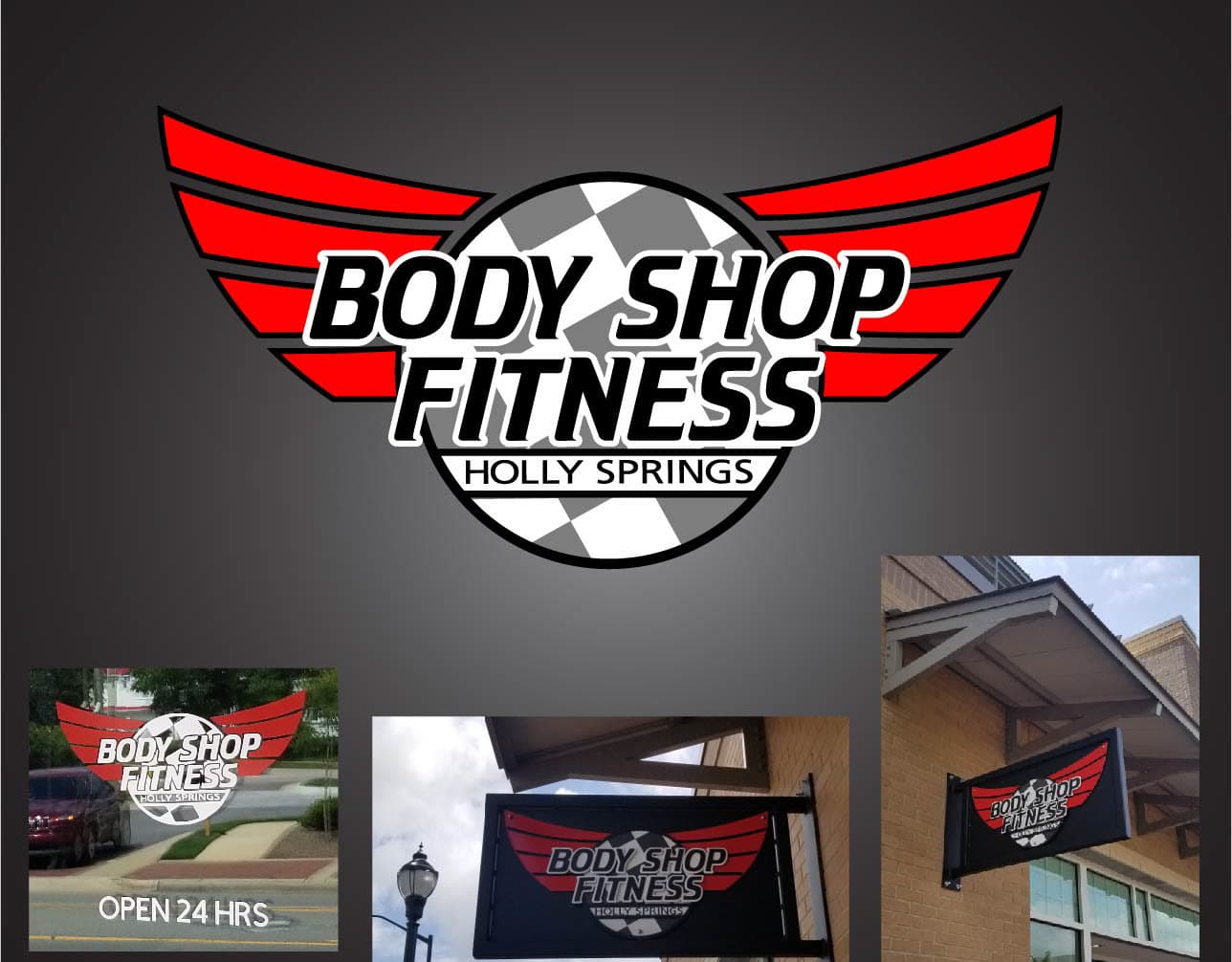
A mark has to hold its own on a storefront, a shirt, or something you can pick up.
My background in promotional and apparel production shapes how I think about identity. The finished file is part of the job. Where it goes next matters just as much.
See the Body Shop Fitness storyInstinct, with a method.
Room to explore. A clear direction. Files ready for the world.
Find the weird truth
Start with the founder, the work, and the small memories competitors can’t copy.
Map the market gap
See what the category already owns so the brand can choose contrast on purpose.
Sketch until it clicks
Move fast through raw ideas before committing to polish, systems, and production rules.
Build for rollout
Deliver marks, color, type, usage notes, and files that work on shirts, signs, decks, and real materials.
A little more background
ECU cause-tee programsECU News Services documents Jason Braden’s fundraiser T-shirt work through Perfect Promotions; the linked 2019 article credits him as Jason Ussery.
Perfect Promotions backgroundPromotional and apparel production context behind the production-aware design lane.