

Body Shop Fitness — Holly Springs
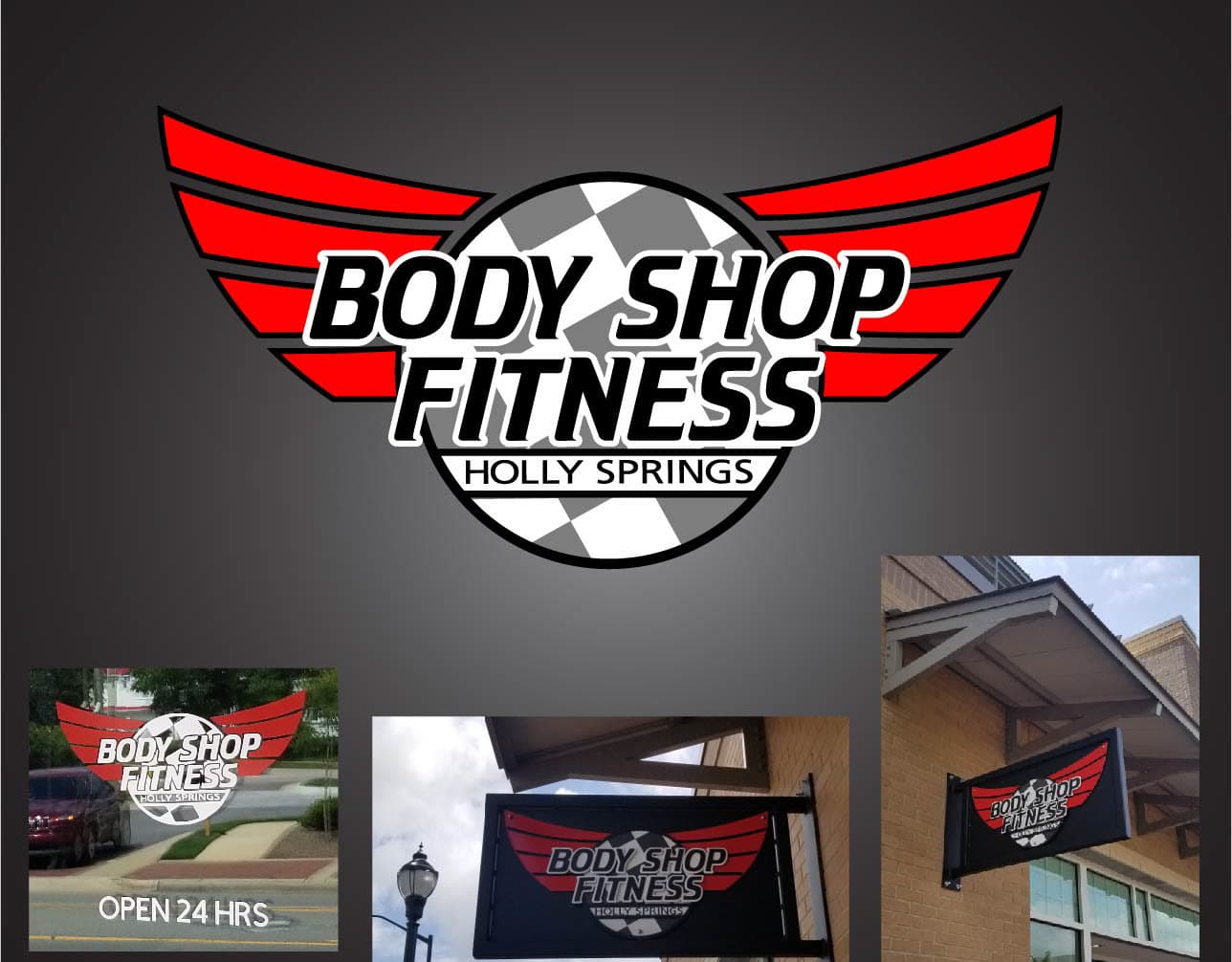
A local gym identity developed from the client's rough sketch through early concepts, a winged final mark, and physical storefront signage.
 Identity
- Role
- Identity design and practical rollout
- Artifact
- Logo, sign, and local-business applications
- Use
- Physical location in Holly Springs
What is visible, what is verified, and where the boundary sits.
Begin with the client's rough idea
The client arrived with a hand-drawn concept. Jason used it as the starting point while considering what the future gym should communicate: clean, no-nonsense dedication and forward movement.
Reduce the idea, then find the motion
Early concepts tested minimalist geometry and running figures. The selected direction paired a checkered wheel with red wings to suggest speed and upward progress, then tightened through production-ready revisions.
The identity leaves the presentation
The final lockup appears on a projecting exterior sign and storefront graphics at the Holly Springs gym. The physical placements are the proof that the mark held up in use.
From first marks to real-world use.
Owner-supplied archive material, kept in its original sequence and labeled without reconstructing missing steps.

Where this work shows up.
- Logo lockup
- Exterior signage
- Storefront application